PROJECT - Charting the Weather
In this project, you will look at a large data set, 366 rows of data. These are daily weather data from the weather station near Bemidji, MN. One daily summary for each day of the year (why are there 366? I’ll let you figure it out).
Your job is to take the raw data and build some charts with it.
Directions
- Download the start file
- Open it this .csv file in Excel and save it as an excel spreadsheet file (.xlsx)
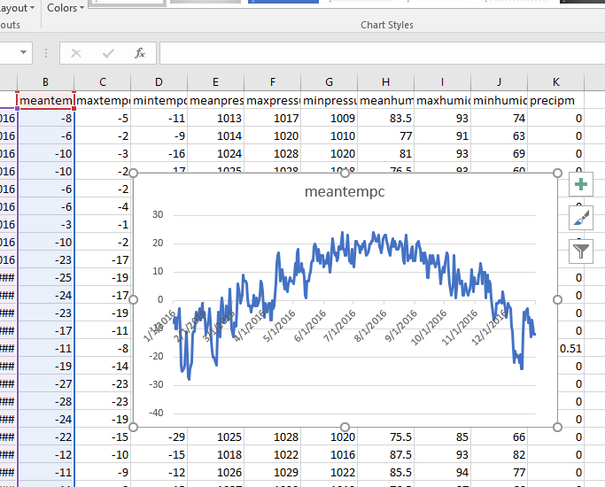
- To create the first chart, select the first two columns of data, that is Columns A and B, the date column and the mean temperature column.
-
In the Insert tab, select the basic two-dimensional line graph. It should look like this:
- Create another sheet and name it Charts.
- Move your line chart to that sheet and situate it at the top left of the sheet.
- For the rest of the project, you will put all of the charts you create in this sheet.
Requirements
You will build 5 charts:
- A line chart showing just the mean temperature throughout the year (already demonstrated)
- A line chart showing the mean, min, and max temperature throughout the year
- A column chart showing precipitation throughout the year
- A line chart that compares mean temp and mean humidity throughout the year
- A combo chart showing mean pressure as a line and precipitation as columns
Extra Credit Charts:
- See if you can find a way to build a chart that shows the cumulative precipitation throughout the year. That is, it should keep going up.
- Try to build a pie chart that shows percentage of precipitation by month.