TUTORIAL 6 - Tables and Pivot Tables
In an earlier tutorial, we looked at how you can take a range of data and make it into a table. Now, we are going to look at some advanced ways in which you can use those tables to make the data fit your needs.
At every step of this tutorial, it is very important to stop and think about what you’re doing and what information you are gaining by performing this particular action.
Tutorial
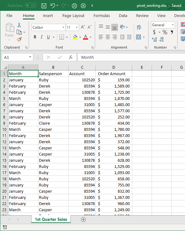
First, let’s consider how our table might be structured. When we conceptualize data ranges. Often a data range is just a structured collection fo individual data entries. A list, if you will. So for example, let’s imagine our company has four salespeople. We might imagine a table with the following columns:
| Column Name | Data Type |
|---|---|
| Month | The Month The sale took place |
| Salesperson | Name of the person who made the sale |
| Account | Account number of the customer |
| Order Amount | The amount of the order in dollars |
Tables
- Download the start file.
-
Examine the sheet and get a sense of what it’s reporting. Each line is an individual sale of some product made by a particular sales person, during a month, and for some total amount.
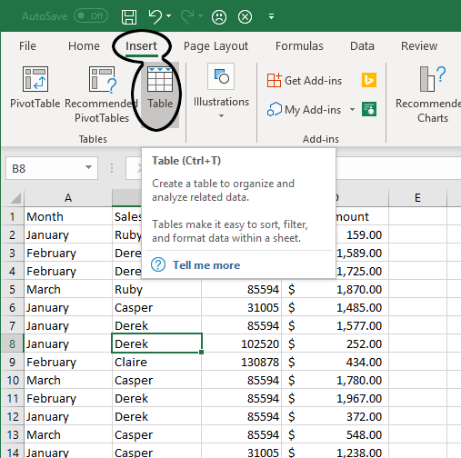
- Select any cell inside of the data and go to the Insert tab.
-
In the Tables group, click on the Table tool.
-
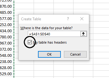
In the Create Table dialog, ensure that the range is correct (you’ll see the ants marching around your data). Also, ensure that the My table has headers box is checked.
-
In the Table Tools Design tab, in the Table Styles group, select any style you wish. In the Table Style Options group, observe what happens when you turn on or off the checkboxes for Banded Rows, or Banded Columns, and the other options. Ensure that it looks like this before moving on to the next step:
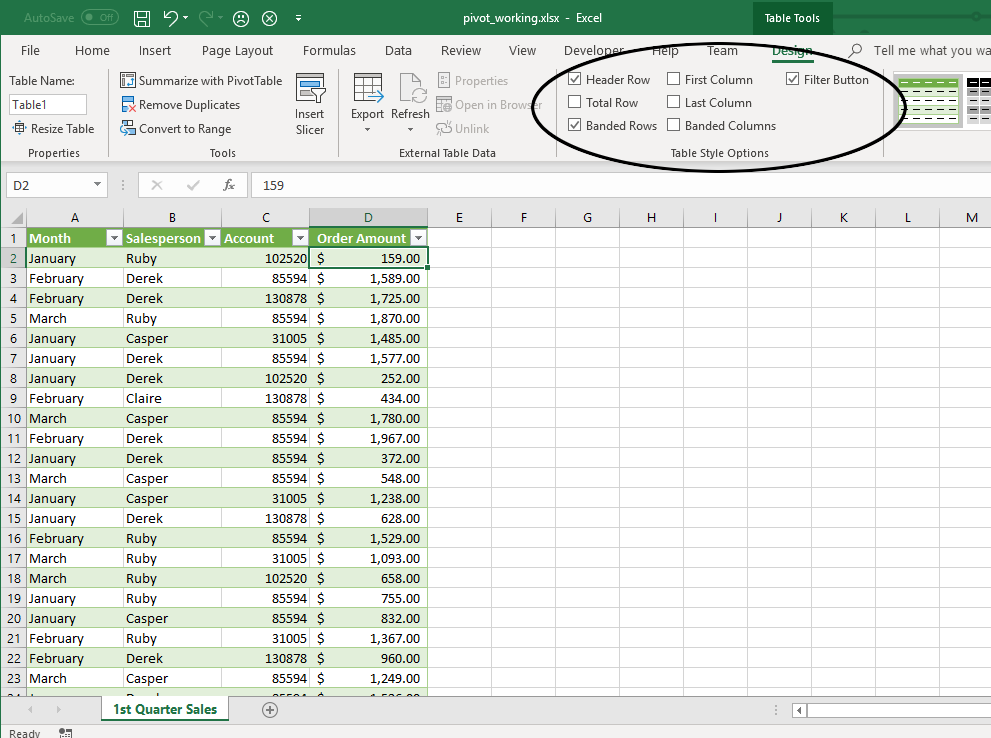
- In the Properties box, change the table name to SalesData.
Sorting and Filtering
An important thing to remember is that once you define a table in Excel, it takes on certain properties. Before creating the table, Excel will treat it as a sheet with a bunch of independent pieces of data. Now, it understands that you have an interrelated set of data and this allows you to manipulate it in some interesting and useful ways.
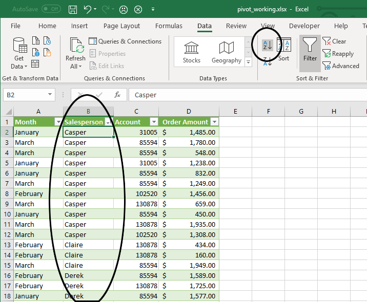
- Select a cell in the Salesperson column.
-
In the Data tab, Sort & Filter group, click the Sort A to Z Button. The table is now sorted by the name of the salesperson.
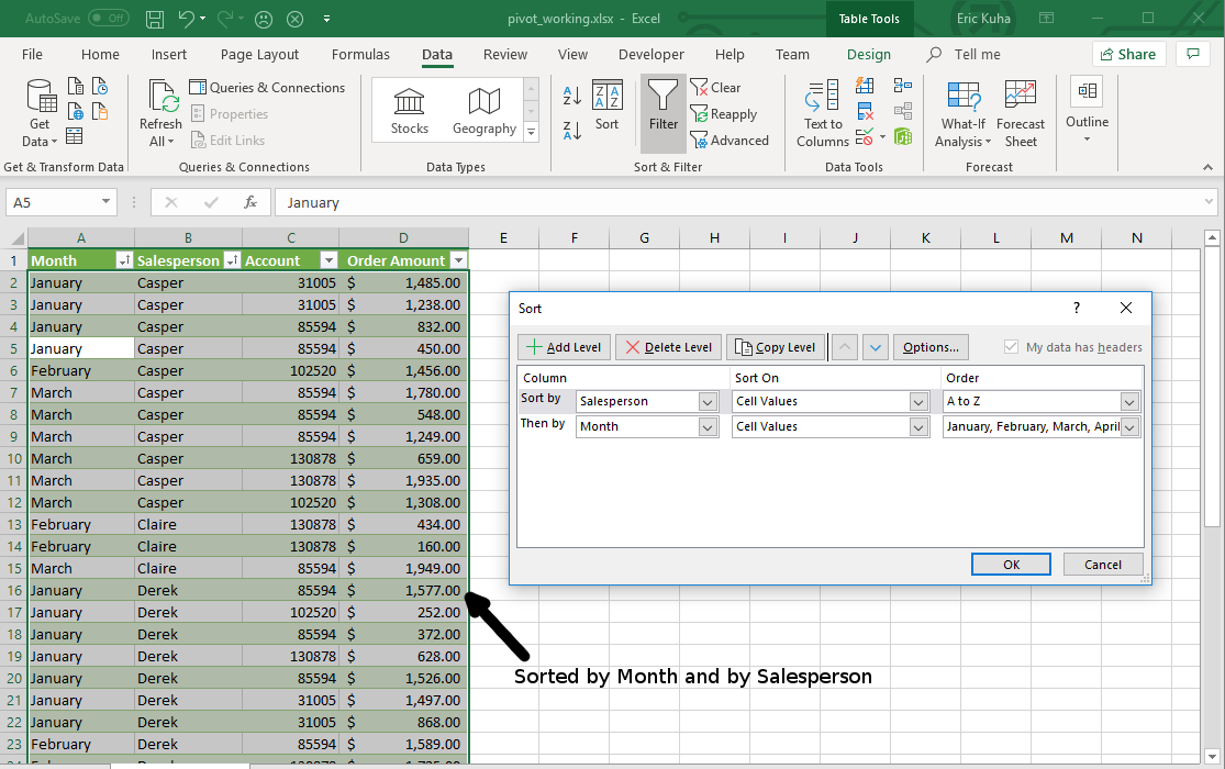
- Now, select any cell in the table data. Again, in the Data tab, click the Sort button to bring up the Sort dialog. Here, you can add further sort conditions to your table. Click Add Level.
-
In the new sort level, for the Column box, choose Month. Leave the Sort On as Cell Values. In the Order box, select Custom List, and select the list that says January, February, March, etc. Click OK and then click OK and observe the results.
-
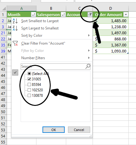
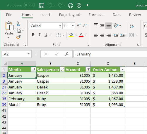
We can also filter data, that is, omit data that we don’t need at the moment (wihtout deleting it). Click the filter button next to the Account column heading. Remove the checkmarks from all entries except account 31005 and click OK.
-
Now only the data for that account is displayed. To verify, examine the row numbers and see how it skips some rows.
Now, we want to try something a little different. We’ll add a different kind of filtering method that’s a bit more interactive. Introducing the Slicer.
-
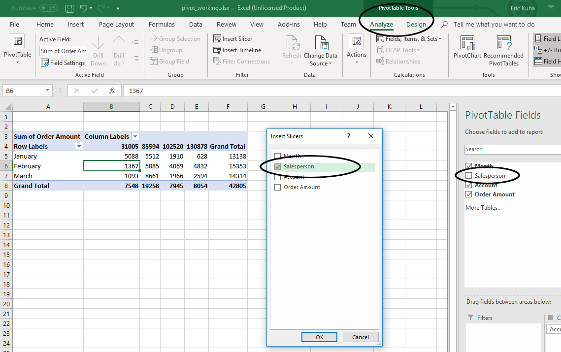
Next, back in the Data tab, in the Sort & Filter group, click Clear to clear all filters on the data. Next, in the Table Tools Design tab, in the Tools group, click on Insert Slicer. Click in the box next to Salesperson to select it and click OK.
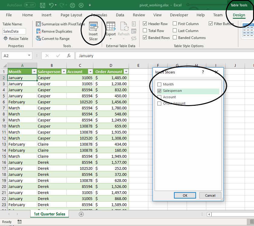
-
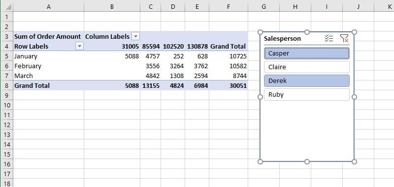
Reposition and resize the slicer so it looks nice. You can also apply a style to it if you like. Observe what happens when you click on the names of the salespeople. There are also two buttons on the top of the slicer which allow you to clear the filter or select multiple items.
Totals and Subtotal
We have a list of sales data now. Let’s say we want to total everything up and see how it all adds up. We can simply add a total row to see the final totals of any numerical columns. We can even do other statistical functions (i.e. average, median, etc), but if we want more granular control of how totals are calculated, we can also add subtotals with a few extra clicks.
-
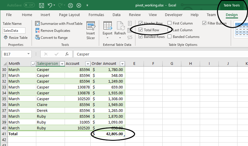
Click on any cell within the data set. In the Table Tools Design tab, Table Style Options group, check the Total Row option and scroll to the bottom of the table. Observe that you now have the total sum of all of the sales in the table.
-
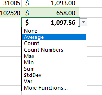
Mouse over the total on the table and then click on the dropdown menu that appears to the right. Select Average from this menu to get the average sale total for the entire quarter:
Next up, Pivot Tables.
Pivot Tables
This is a tool that is deceptively simple to use, but somewhat difficult to understand conceptually. What we are going to do, in essence, is rotate some of the data around so it becomes columnar data. We are going to turn this essentially one dimensional list of data into a two-dimensional matrix which can be sorted, filtered, and visualized in a hundred different ways.
-
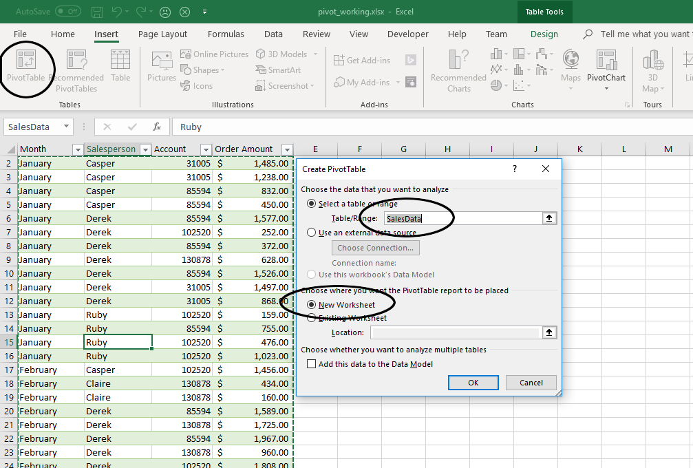
Ensure that the cell selection is somewhere inside the data. In the Insert tab, in the Tables group, click on PivotTable. In the dialog that opens, the defaults should be okay, but look over them so that you understand them. Most importantly, we want to ensure that the correct data is selected and the pivot table is being generated in a New Worksheet.
-
Now, right off the bat, you will see nothing much. But here’s the breakdown of what is here:
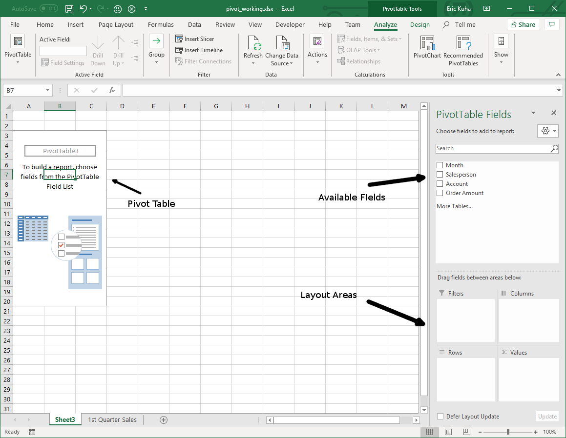
Area Description ROWS These will become row labels COLUMNS These will become column labels FILTERS This is where you can filter data based on any of the field data VALUES Fields placed in this box will populate the table data cells based on a formula that you choose (SUM, AVERAGE, etc) In essence, the purpose of a pivot table is to be able to take the fields and rotate them around so the actual data becomes the rows and columns, allowing you to compress and summarize the data for visualization purposes.
-
In the PivotTable Fields box, click on the checkbox next to the Salesperson field.
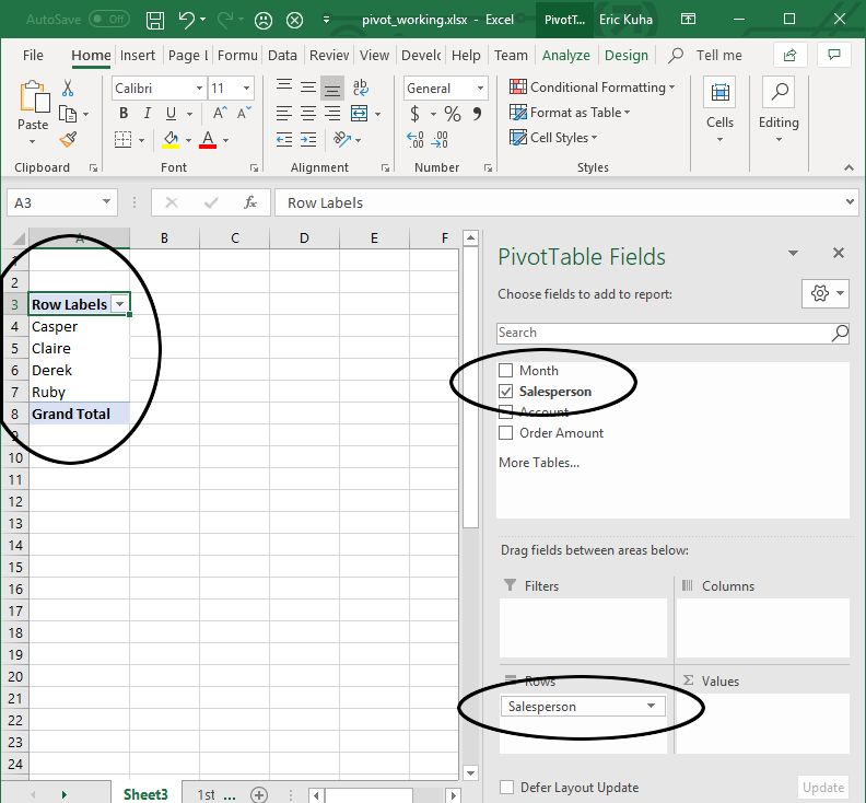
Notice the names of the individual salespeople are now the row labels for this new table. Also, notice that Salesperson is now in the Rows area in the PivotTable Fields box.
-
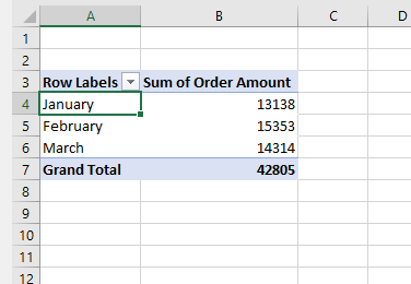
Click and drag the Month and Account fields down to the Rows box as well and observe how these now form a sort of row hierarchy. Last, drag Order Amount to the Values box. This is what it should look like:
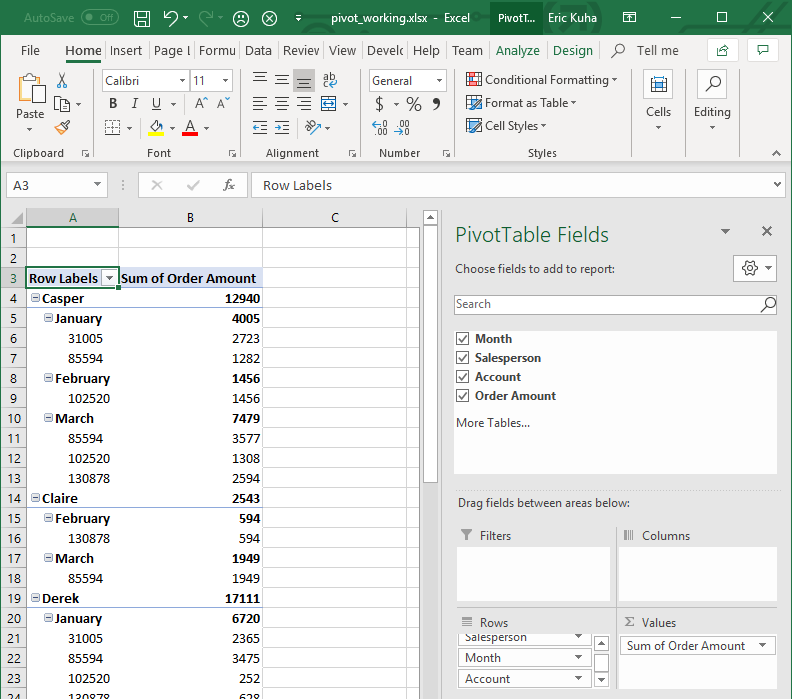
-
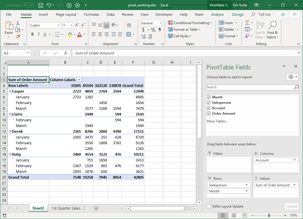
This is the beginning of a useful summary of the data. At the very least, it’s sorted and organized. However, the real magic of a pivot table is in deciding which fields should be columns and which fields should be rows. So we are going to pivot the Account field up to the Column box. Simply click and drag it out of the Rows box and into the Columns box.
-
Now, let’s add a slicer to this pivot table. First, ensure that the cell selector is somewhere inside the pivot table. Then, uncheck the Salesperson field in the PivotTable Fields box on the right sidebar. Next, in the Pivot Tools Analyze tab, in the Filter group, click the Insert Slicer tool. In the dialog that opens, select Salesperson and click OK.
-
Now, you can use the slicer to select data for any of the salespeople on the fly.
-
Rename the sheet where your pivot chart is Sales Data Pivot.
Pivot Charts
Next, we’ll use the Recommended feature to automatically generate a pivot table and use the resulting table to build a dynamic chart based on the pivot data.
-
Go back to the 1st Quarter Sales sheet. Ensure that the selector is inside the table. In the Insert tab, Tables group, click the Recommended PivotTables tool. In the dialog that opens, select Sum of Order Amount by Month. It should be the second one down in the list.
-
In the Values box at the bottom right of the window, select Sum of Order Amount and click on Value Field Settings
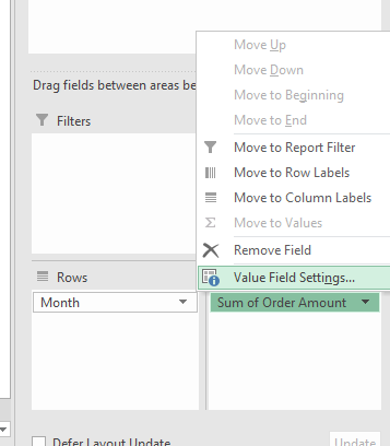
- First, change the calculation to Average. Then, Click Number Format and and change the format to Currency. Observe the result in the pivot table.
-
Now, select the newly created pivot table and in the PivotTable Tools Analyze tab, Tools group, click the PivotChart tool. Choose the Clustered Column and click OK.
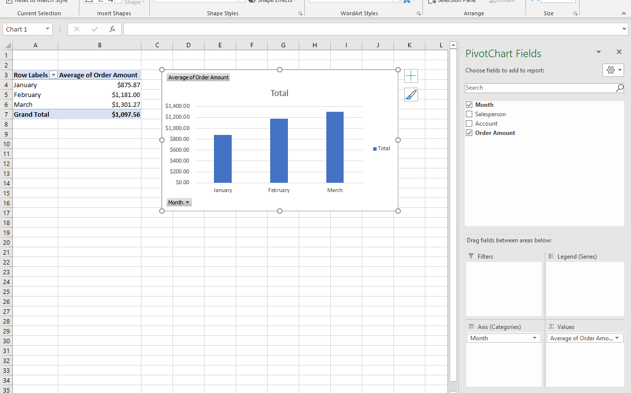
- Change the name of this sheet to Monthly Sales.
Conclusion
We have only scratched the surface of what you can do with these tools here. From here, you can do things like apply styles, or different data visualizations. With other data sets, it is always a good idea to try out different combinations of fields in a pivot chart to see how the data behaves. Use slicers to select specific data. Above all, let Excel do as much of the heavy lifting as possible. From start to end product, the tables and charts in this tutorial can be made in under five minutes. It’s just a matter of practicing with the tools and building confidence.