TUTORIAL 4 - Functions and Basic Charts
It’s not time to look at how we can visualize data. Let’s create some charts!
For this tutorial, we’ll look at some basic charting as well as some more statistical functions.
Charts
First, though, we should think about charts and what they’re for. Charts and graphs are for visualizing data, but it can often be tricky to decide just what kind of chart to use. So how do we decide? Here’s a basic rundown, then we’ll look at a couple of examples:
| Chart Type | When to use it |
|---|---|
| Line Graph | Line graphs are used to track changes over time. So if there’s a time dimension, use a line graph |
| Pie Chart | Use a pie chart to compare parts of a whole. Like a pie! |
| Bar Graph | Like a line graph, used to compare changes over time, but usually best for large changes. Can also be used to to compare things between different groups |
| Scatter Plot | If you have two variables that relate to each other, you can set one to the X axis and one to the Y axis. It shows the relationship between two things |
What does each one look like?
Line Graph
A line graphs are really great for showing changes over time. A very common example would be to show stock prices changes over time. For a fun contemporary look at a line graph, here’s the price of BitCoins since about 2010.
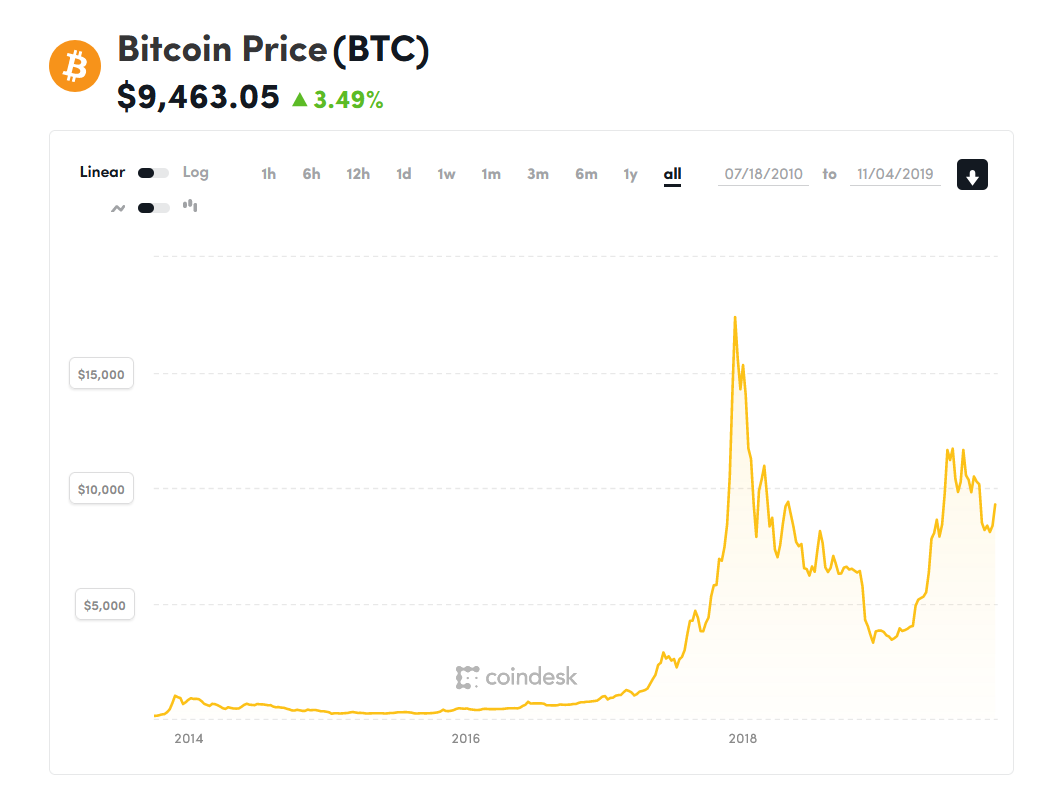
As you can see, it gives a fantastic visualization of the change in price over the last year for the most famous crypto-currency. By the way, if you’re curious, you can get a good overview of Bitcoin on wikipedia. If you’re really interested, the original whitepaper for Bitcoin is only 8 pages long and is a pretty interesting read as well.
Pie Chart
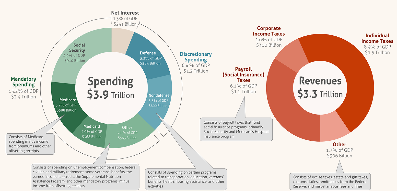
A pie chart is great to compare parts of a whole. A particularly infamous example would the United States budget. Here’s a comparison of US spending vs US revenue in two pie charts:
Bar Graph
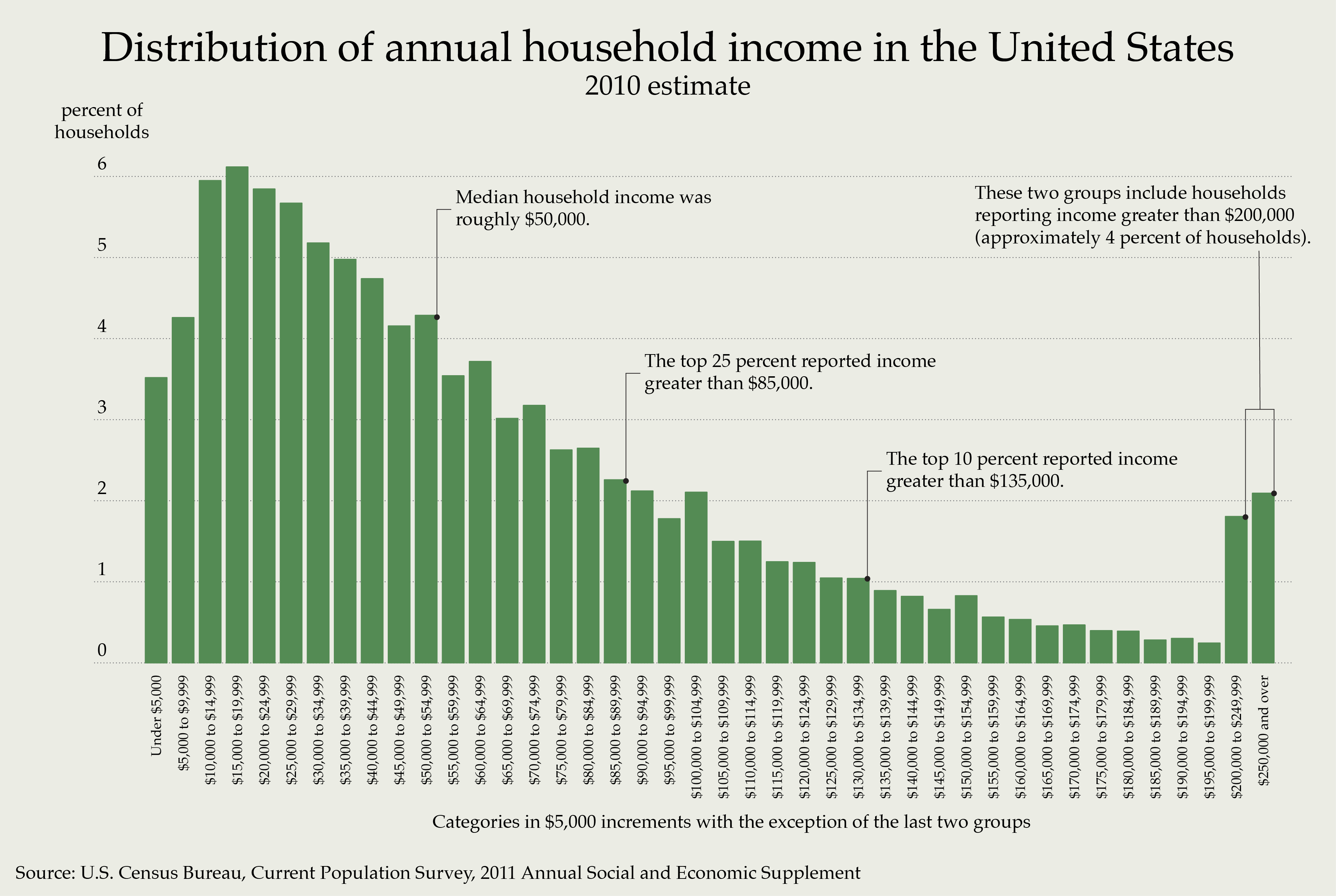
Bar graphs are great for comparing different groups of things. For instance, this chart shows the what percent of US households earn what amount of money in $5000 increments. Except for the last couple of bars, which are clearly labeled. The purpose of the chart is to show income inequality in the United States and illustrates the point quite nicely. Though, of course, it only tells part of the story. The whole story is, perhaps, somewhat bleaker even than this. But that’s beyond the scope of this tutorial.
Scatter Plot
Scatter plots allow you to examine potential correlations between two variables. Sometimes there’s a correlation and sometimes there isn’t. Here’s an example:
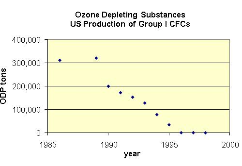
This scatter plot correlates ozone-depleting chemicals with time, showing a promising trend after the ban of CFCs.
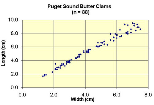
This scatter plot shows the correlation between the length and width of a particular species of clam. This one is interesting in that it shows what’s called a linear correlation. That is, you could easily draw a straight line through the points that would be very close to all of them.
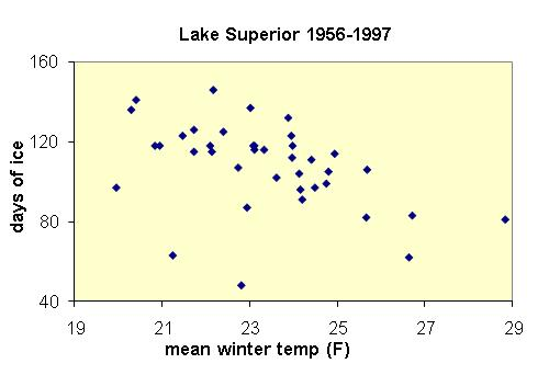
This plot shows the relationship between days of ice on Lake Superior and the mean winter temperature. This one is not so easy to draw a line through, but a weak correlation can be seen where the more days of ice on the lake tend to mean that the winter is colder. Or vice versa.
Spurious Correlations
Some scatter plots contain spurious correlations however. That is, they look like they show a real correlation, but there is no way the correlation can possibly be causal. For some entertaining spurious scatter plots, check out this website.
Tutorial
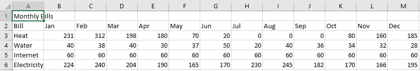
We’re going to take another look at the yearly bills worksheet that we saw in a previous tutorial.
-
Download the start file
-
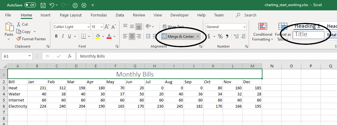
The data is very raw. As in Tutorial 2, select cells A1-M1 and click Merge & Center. Then add the Title stile to this new cell. It should look like this:
-
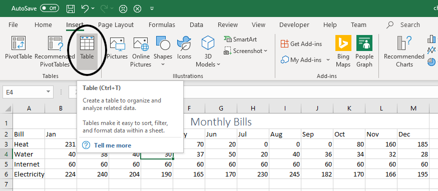
Next, select any cell that is part of the data table (E4, for example), and then, in the Insert tab, click Table. You’ll notice that this time, Excel mistakenly selects cell A1. To fix this, simply click and drag to select only cells A2:M6. Ensure that “My table has headers” is checked and click OK.
-
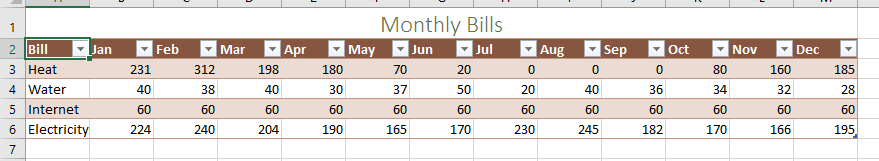
Select a table style that you like and your spreadsheet should look like this. If anything is wrong, undo everything (Ctrl-z) and start over.
-
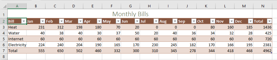
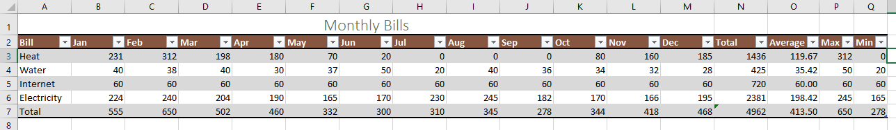
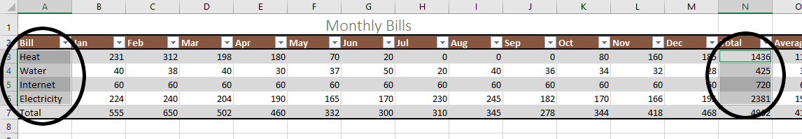
Add a total row and a total column in the way that you wish. Ensure that it looks like this:
Now we’re going to add some columns for statistics. In particular, the AVERAGE(), MAX(), MIN() functions and a “percent of total” column. This way we can get some more data to include in our charts.
| Function | Purpose |
|---|---|
| AVERAGE() | Adds all cells together and divides by the number of cells |
| MAX() | Finds the highest number in a range of cells |
| MIN() | Finds the lowest number in a range of cells |
Getting started
- In cell O2, enter the new column heading AVERAGE. Hit ENTER.
-
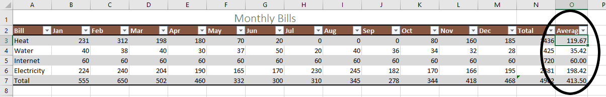
In cell O3, enter the average function. Type =AVERAGE(, then highlight the range B3:M3. Make sure you do not include the average column. Notice that when you hit enter, the entire column fills with averages. Excel has intelligently predicted what you are trying to do as a consequence of formatting the data as a table. Adjust the number of decimal places shown so it looks nice.
-
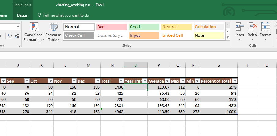
Follow the same process for Columns P and Q and the MAX() and MIN() functions. The result should look like this:
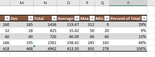
- In cell R2, enter the new heading Percent of Total.
- Select cell R3. Enter =, click on cell N3 (the total for the heating bill), press / for division, and click on cell N7 (the total for all bills), finally press F4 on the keyboard to convert the reference to N7 into an absolute reference. The final formula will end up looking like this (note how Excel automatically re-labels some cell references):
=[@Total]/$N$7. When you hit Enter, it should fill in the rest of the column autmoatically! -
Change the number format of these cells to percentages, resize the column, and you should have something that looks like this:
A bar graph
Now, we want to make some charts. It would be useful to see how various bills fluctuate throughout the year. So we’ll want to build a basic bar graph.
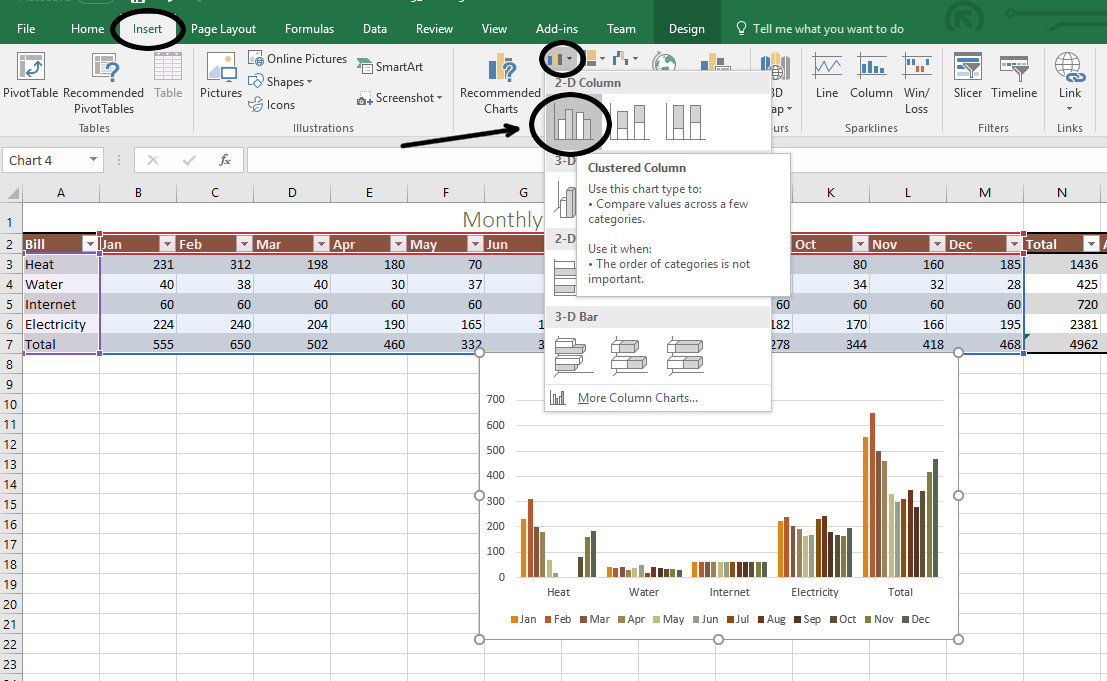
- Select the cell range A2:M7. That is, grab all of the month data plus to the total row, but not the total column.
-
In the Insert tab, Charts group, select the Column tool and select the first option, Clustered Column:
-
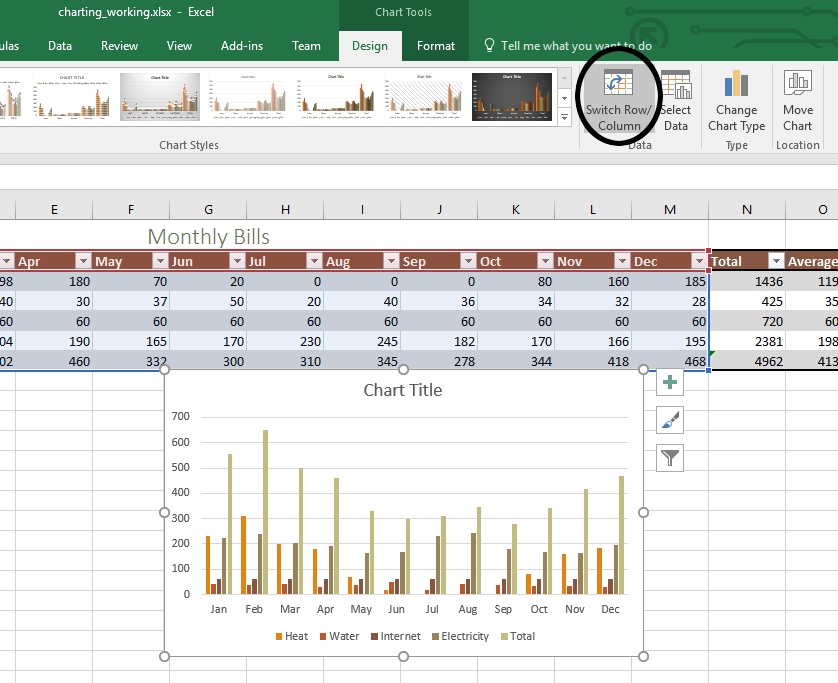
The first thing you’ll notice, is that our chart looks terrible. That’s because it’s being correlated by bill and not by month. Let’s fix that. You should be in the new Chart Tools: Design tab. In the Data group, select the Switch Row/Column tool. It will look a lot more reasonable.
- Examine your chart. The chart is still a little weird and if you look carefully at the legend on the bottom of the chart, you might see why. Notice that in each month, we have a bar for heat, water, internet, electricity, and Total. Total doesn’t belong here because it’s literally the total of the other four. So it’s basically drowning out all of the other bars and dominating the entire chart. So we’re going to do a little surgery on our chart to make this look a little more reasonable.
- While still in the Chart Tools: Design tab, click Change Chart Type in the Type group.
- Select the Combo type.
-
In the dialog, make sure all four of the bills are still set to Clustered Column, and the total is set to Line. Last, check the Secondary Axis box next to the Total line.
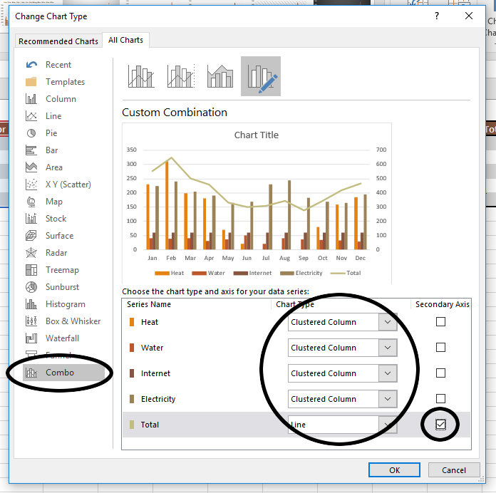
- Press OK.
- To polish up our Chart a little bit, double click on the Chart Title to edit it and change it to Yearly Bills.
- Finally, in the Chart Tools: Design tab, click Move Chart and select New Sheet and change the name to Bills Chart. This moves it to its own sheet in your workbook.
- If you like, feel free to change the Chart Style to something that looks nice.
A pie chart
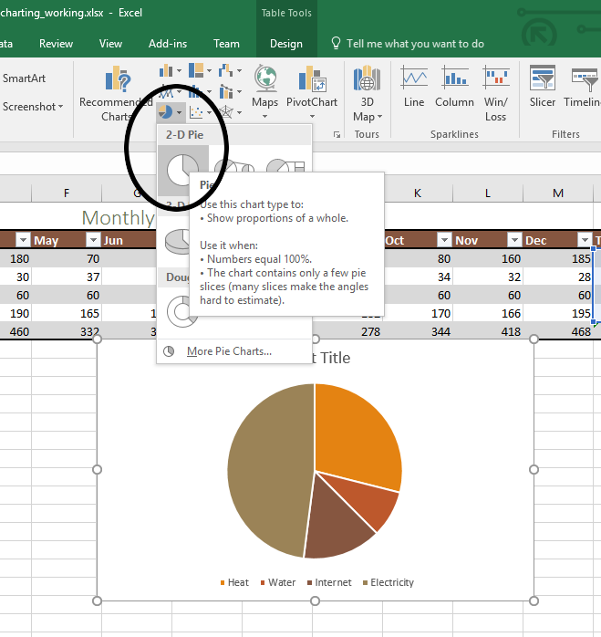
Next, let’s make a pie chart to visualize how the year end totals relate to each other.
- Make sure you’re on the Bills sheet.
-
Select the cell range A3:A6, the names of the four bills. Next, hold the Ctrl key while selecting the range N3:N6. This allows us to select both the names and the totals of each bill.
-
In the Insert tab, select the Pie Chart tool and select the first 2D pie chart.
-
Now, select Add Chart Element, Data Labels, and select the Data Callout option. This puts the bill name and percentage on each pie slice.
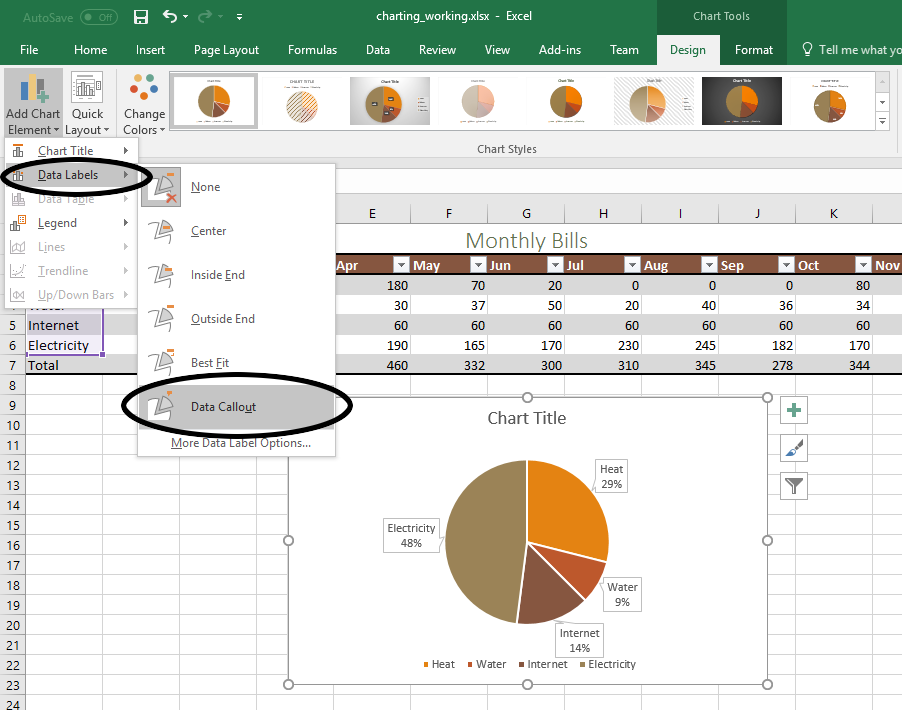
-
Again, in Add Chart Element, Legend, select None since we don’t need it with the data callouts.
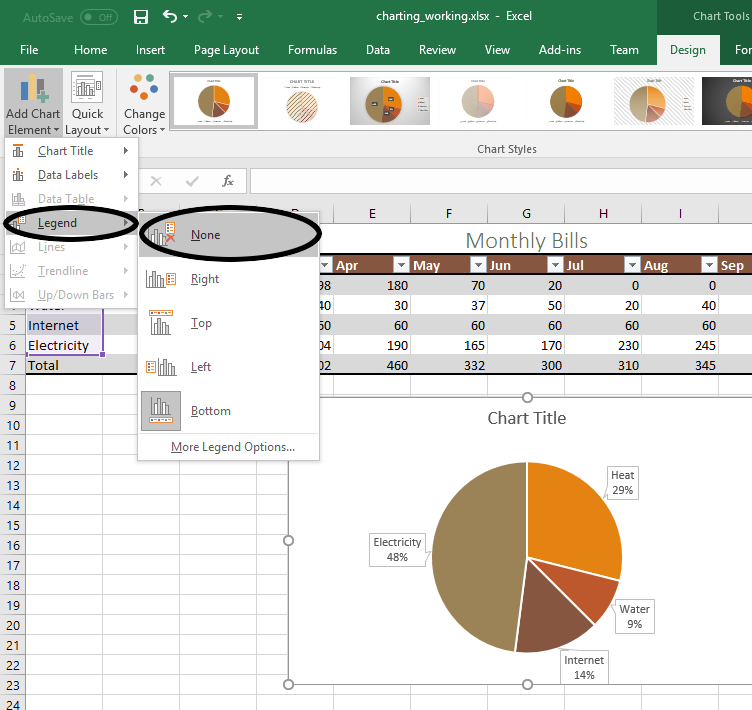
- Finally, change the chart title to Total Bills and move it to its own chart sheet.
Sparklines and Data Bars
Let’s explore two more charting and data visualization tools, Sparklines and Data Bars. Sparklines are like charts but they are contained to a single cell. Data bars are a kind of conditional formatting which allows us to visualize the data in the cells. Let’s see how they work
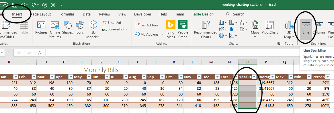
- Select column O by clicking on its header.
- In the Home tab, in the Cells group, click Insert. This should insert a new blank column into our table.
-
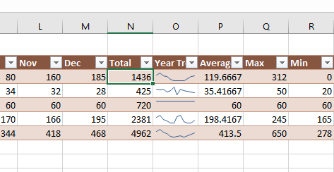
Click on the heading in Column O and change the heading to Year Trend. This is what it should all look like.
- Select the new blank cells O3:O7.
-
In the Inert tab, find the Sparklines group and click Line.
-
The Location Range should be pre-populated with the range
$O$3:$O$7. With the insertion point in the the Data Range box, simply select the cellsB3:M7and that reference should appear in the box. Verify that your screen looks like this image before clicking OK.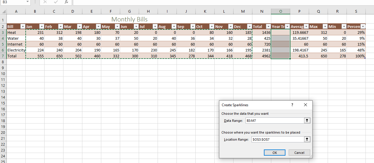
-
The result looks like this:
-
To create the Data Bars, select cells
N3:N6and in the Home tab, select Conditional Formatting. Then simply select Data Bars and choose a style you like. This gives you the ability to visualize data within a cell as it relates to data in other cells.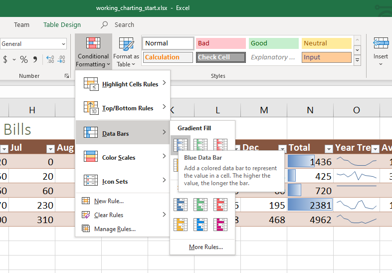
This concludes the tutorial. Submit the file to the course portal as normal.